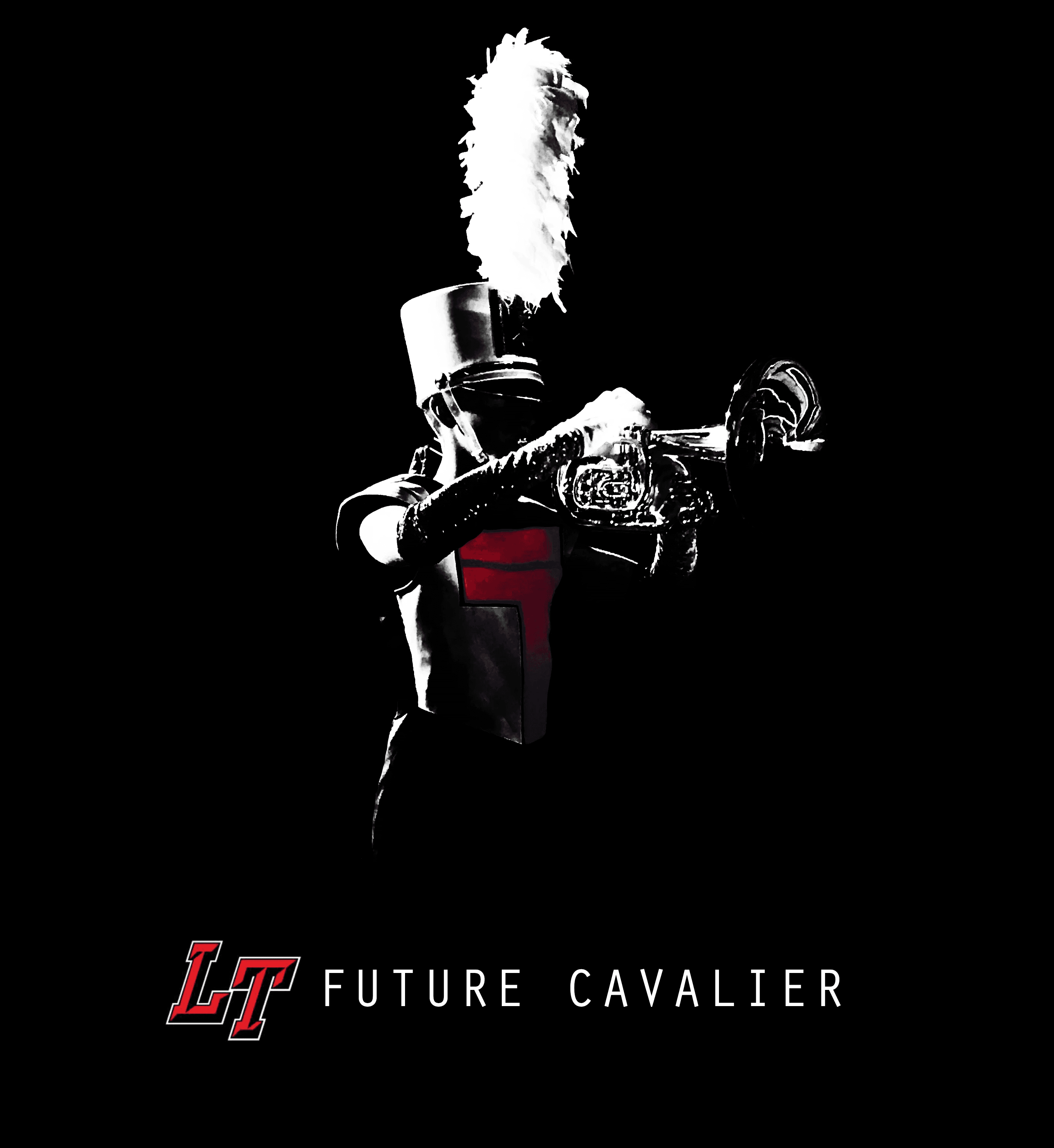
Goal: Create modern branding for band program that is in line with district brand identity
Led design process working with other graphic artists to create new logo. New branding has fully replaced sword branding. Takes advantage of recognizable iconography of the "LT" and uses modern san-serif font. Gradient used on trailer to create depth and interest at a large scale, circle texture on front of trailer to add depth and dimension and front part of trailer to prevent image from feeling "flat".